Tailgreeter Rebrand
Project
No. 228
Client
Tailgreeter
Discipline
Design Studio
Tailgreeter is an online marketplace organizing the best tailgates of the sporting world to bring the best fans and the best hosts together around the United States. The Tailgreeter team came to Number Project in need of a rebrand as they expanded and sought Series A funding with plans to expand their reach vertically within the sports world, but also horizontally into the world of music concerts, and other large scale events.
Specifically, Tailgreeter wanted their new mark to tell the story that they were a tech company that was also rooted in the community and fun of tailgating and community events.

Old Logo
New Logo
Initial Sketches
In our initial explorations, we take as many directions as possible to weed out all the bad ideas and present you with options of sketches we know are closer to working when we move to higher-fidelity ideas.
Honing In on the Mark
Once a direction was solidified towards the symbol of the flag, we explored many variations to find the best mark in that direction.
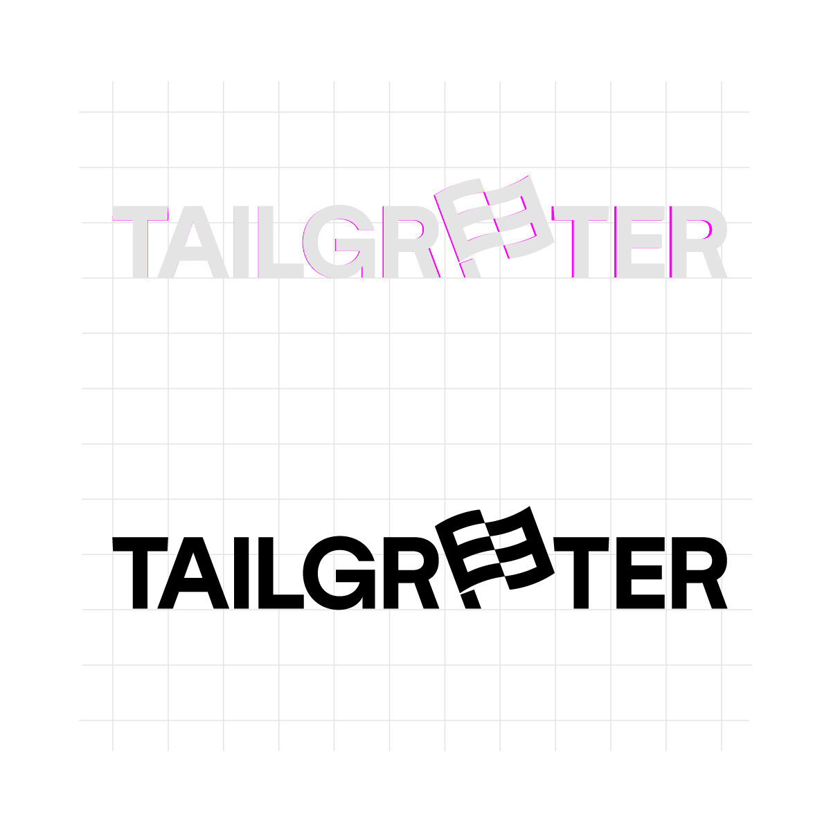
Finalizing the Mark
Selecting from the industry-best fonts, we came to the best option to communicate the Tailgreeter story now and into the future of the brand. We then thought about recognizably and ease of reading to choose the simplest mark possible while still maintaining clear communication in the symbol of the flag.
While it may never catch your eye, we put in the most minute of attention to detail in the final tweaks of a logo to optically perfect spacing, angles, and subtle nods to the brand.
Color Choices
For Tailgreeter, we had to think about the complexity and loud colors of the sports word. The mark would be used in tangent with a broad spectrum of color and imagery, so we made sure that the colors used would stand out in a collection of tones.


